Introducing hotjar and how it works
- November 22, 2019
- Business Advice, Ecommerce Marketing
When it comes to your eCommerce site not only is driving traffic to your website crucial, but converting that traffic into a transaction. We often rely heavily on page views, bounce rates and which items are actually purchased. But have you ever wondered how your site actually works in terms of the customer experience? Or even just curious to see where on your site catches the customers eye? Introducing hotjar, the concept that helps you understand what your customers are looking for by heatmaps. Hotjar is the fast and visual way to understand your site users and what they are looking for. With companies such as Skyscanner, Decathlon and Adobe using hotjar the success speaks for itself. So how does it actually work? Today we have 3 examples of the different heat maps to talk you through.
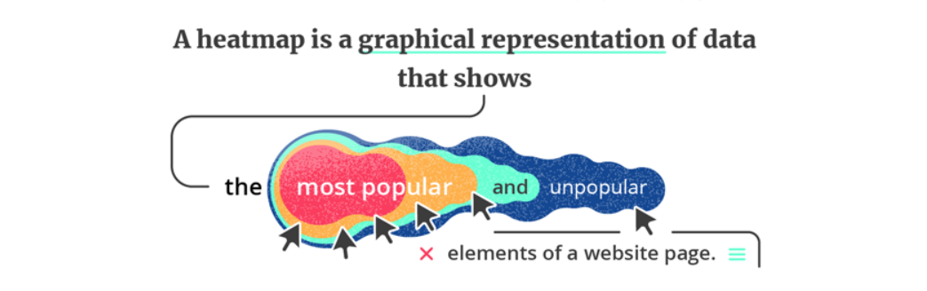
How does a heatmap work?
The way in which a heatmap works is any red parts of the site are the most popular, going to the least popular parts which show up in blue. The implies it is hot and the blue shows the coldest parts of a site. Hotjar has an example on their site of what each part of the heatmap means which you can view here:
Best pages to collect heatmap data on
When it comes to using a heatmap, different pages are likely to give you a wider overview of what is being clicked on throughout the site. By having this data to hand, you then know what really is popular on your site. Choosing to have heatmaps on the main pages and those which you believe to popular are great places to start.
Where the users physically click
With hotjar, you can view where your customers are clicking on your site. Whether they’re clicking on the images, which categories of the site are they browsing and even if they go to click for help. You can track their progress throughout the site. To find out when they’re reaching for the help button and which pages they visit your site. The more red markings on the map, the more it is clicked on. By having this data to hand you can find out if your customers are using the buttons you’d expect, as well as finding out if they’re clicking on parts of the site which aren’t actually clicked.
Where the users hover the mouse
The movement map is all about figuring out where customers go when looking through a site, it can also report back when the customer pauses on a certain part of the site. E.g. if they’re stopping to read something. From a business point of view learning which parts of the site are actually being frequently used can allow for a redesign based on your site and putting the key pieces of information in the right place.

The scroll depth of the users
The last heatmap available is one that provides data on when users stop scrolling on a site. Providing a percentage of when users stop looking on a site. If you notice a high percentage of users stopping to scroll the site near the middle, this may indicate an issue. The same applies if you see lots scrolling to the bottom, then clicking through as it could mean there is a problem on the site.
With data provided by hotjar, you’re able to create a more effective business plan and work on improvements on your site. To find out how PhilAston can help you use heatmaps to improve your site, feel free to get in touch.
Request a free quote
Want us to help you make the internet work for your business? Click below to get a proposal & quote today.
Sign Up Today

More from our blog
See all posts